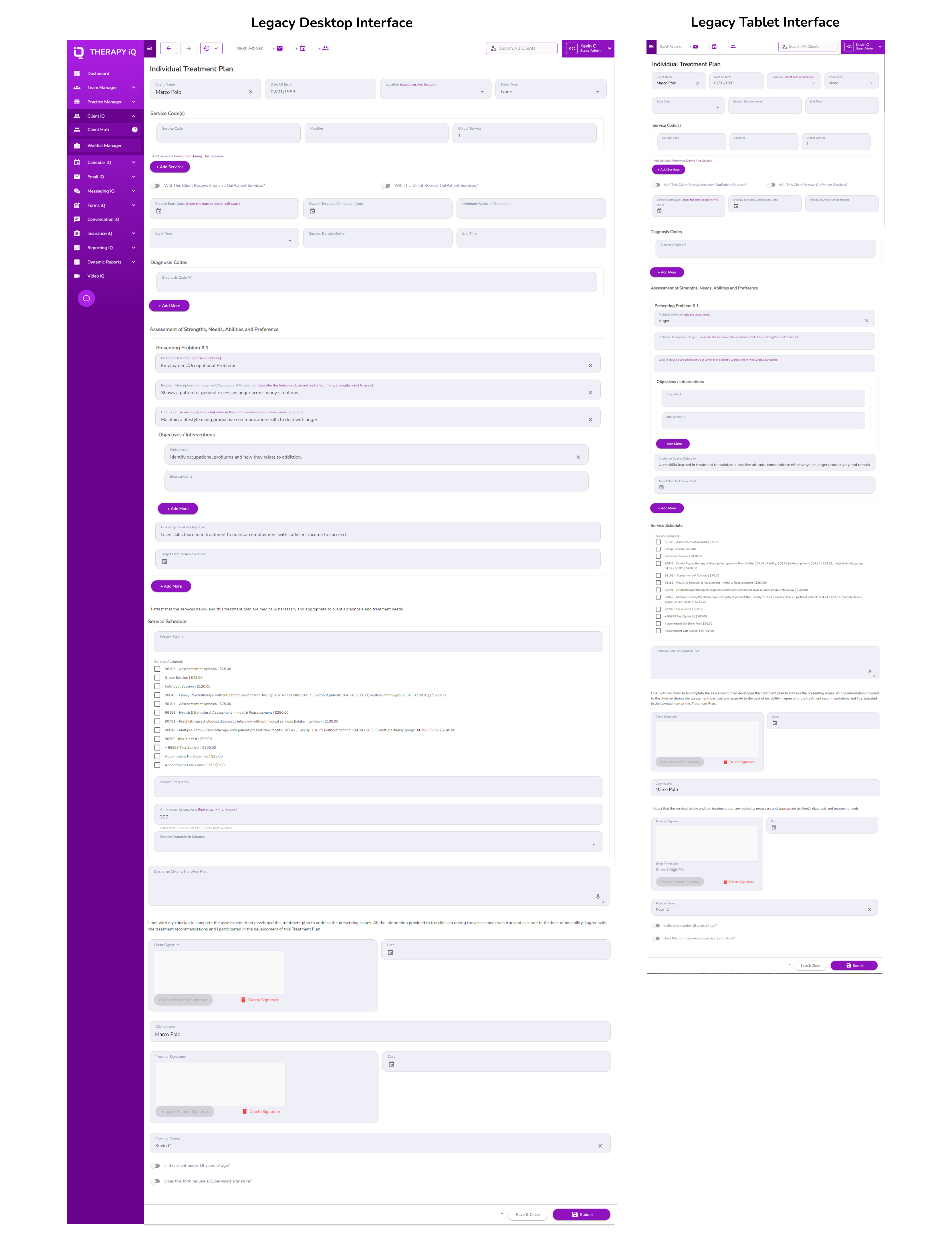
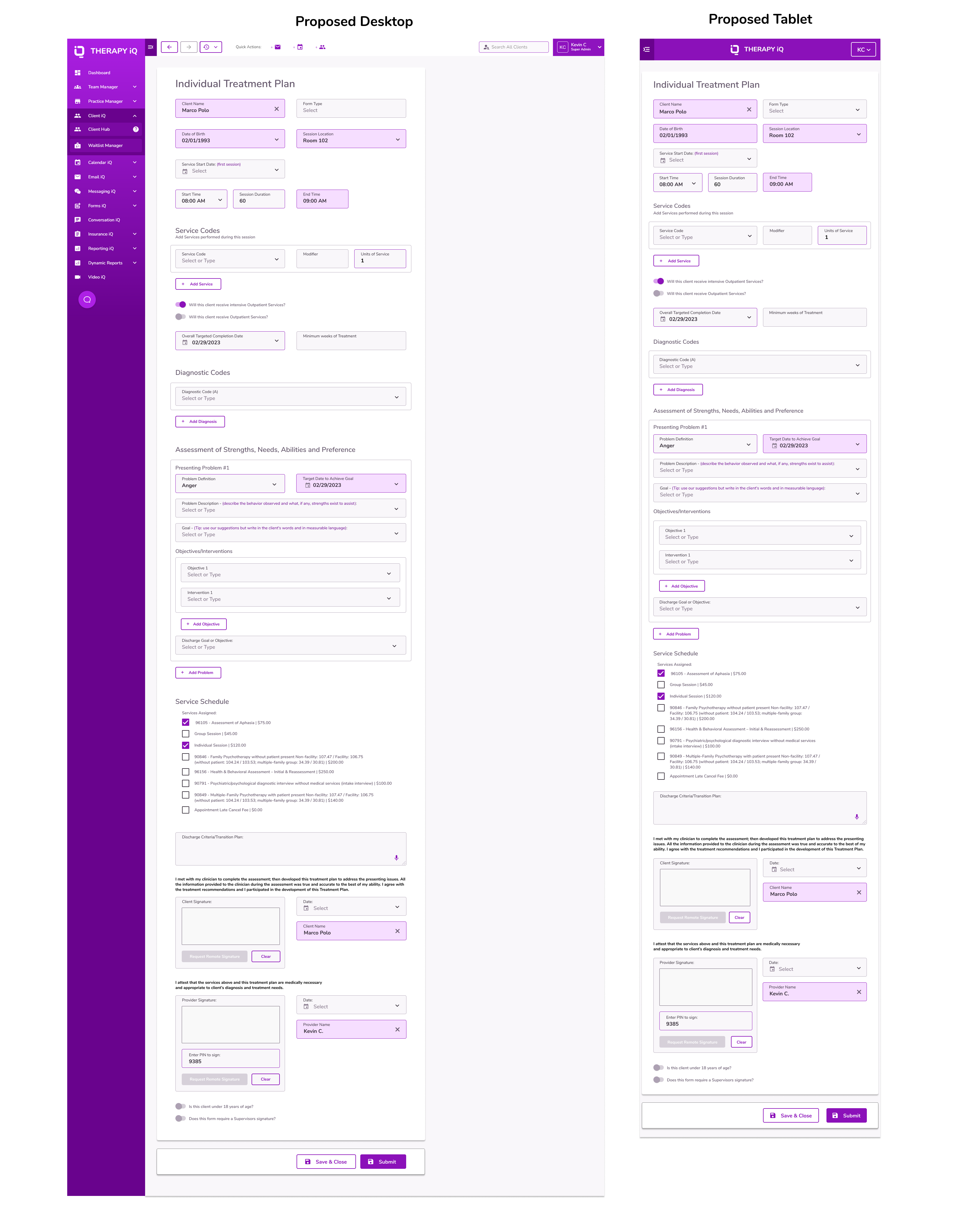
Limiting width to match paper
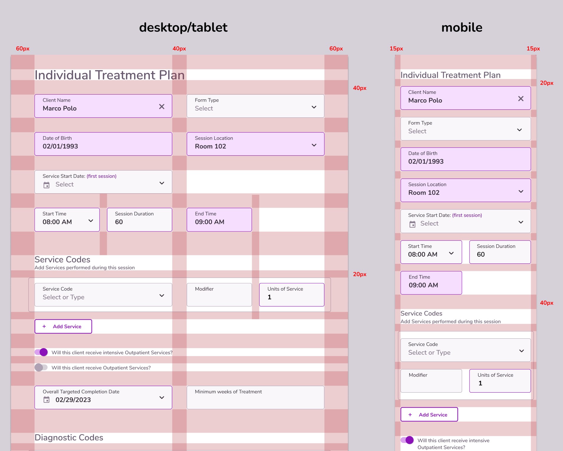
The decision was made that for the following reasons, formatting for forms in Therapy iQ would no longer expand horizontally infinitely. They would be limited similar to a piece of paper.
PDF-ability
Every form we built required a PDF companion. If we continued to use forms that take the full width of the display, we would need to create custom pdfs that reduced the amount of information stored horizontally.
Print-ability
Athough the world has rapidly moved online, healthcare has been slower to adapt and it is still necessary for many Practices to have print versions of many of their forms.
Splitscreen-ability
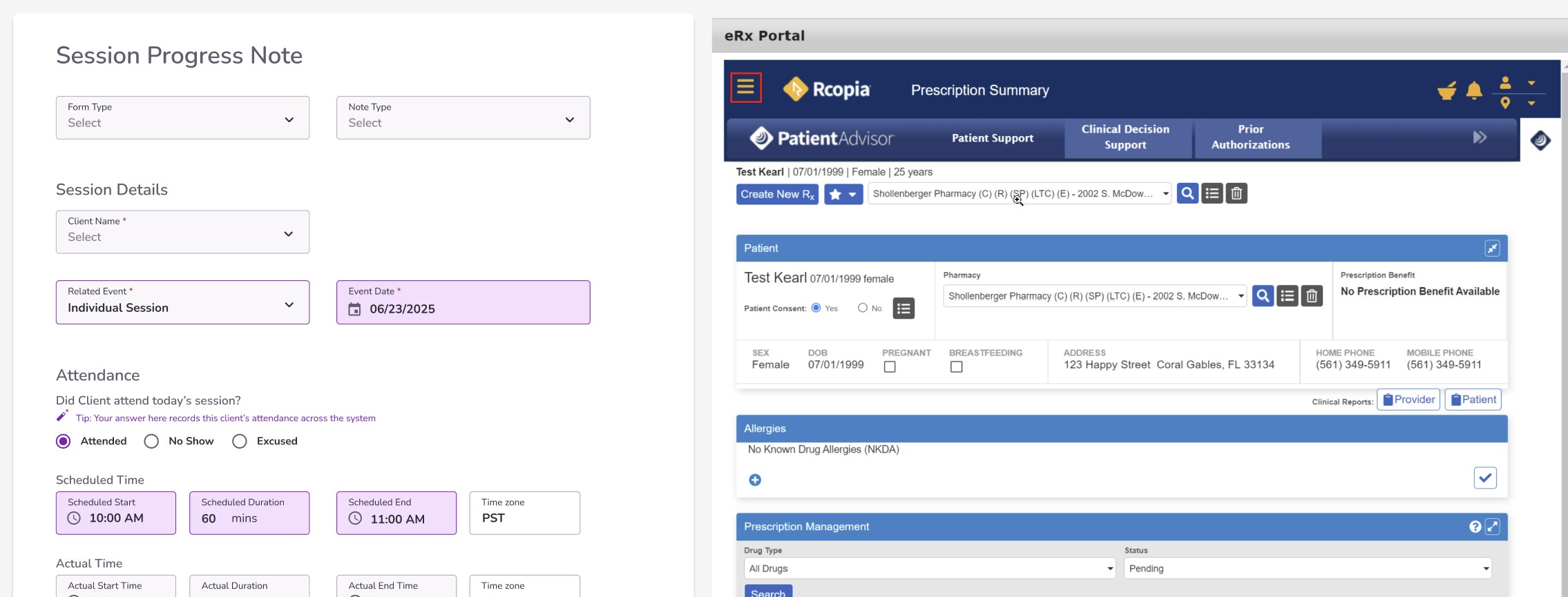
Another advantage is that it allows split screen capabilities that can be very useful in the context of a therapy session, if for instance a progress note could be open alongside an e-prescribe or even a telehealth session.
Familiarity
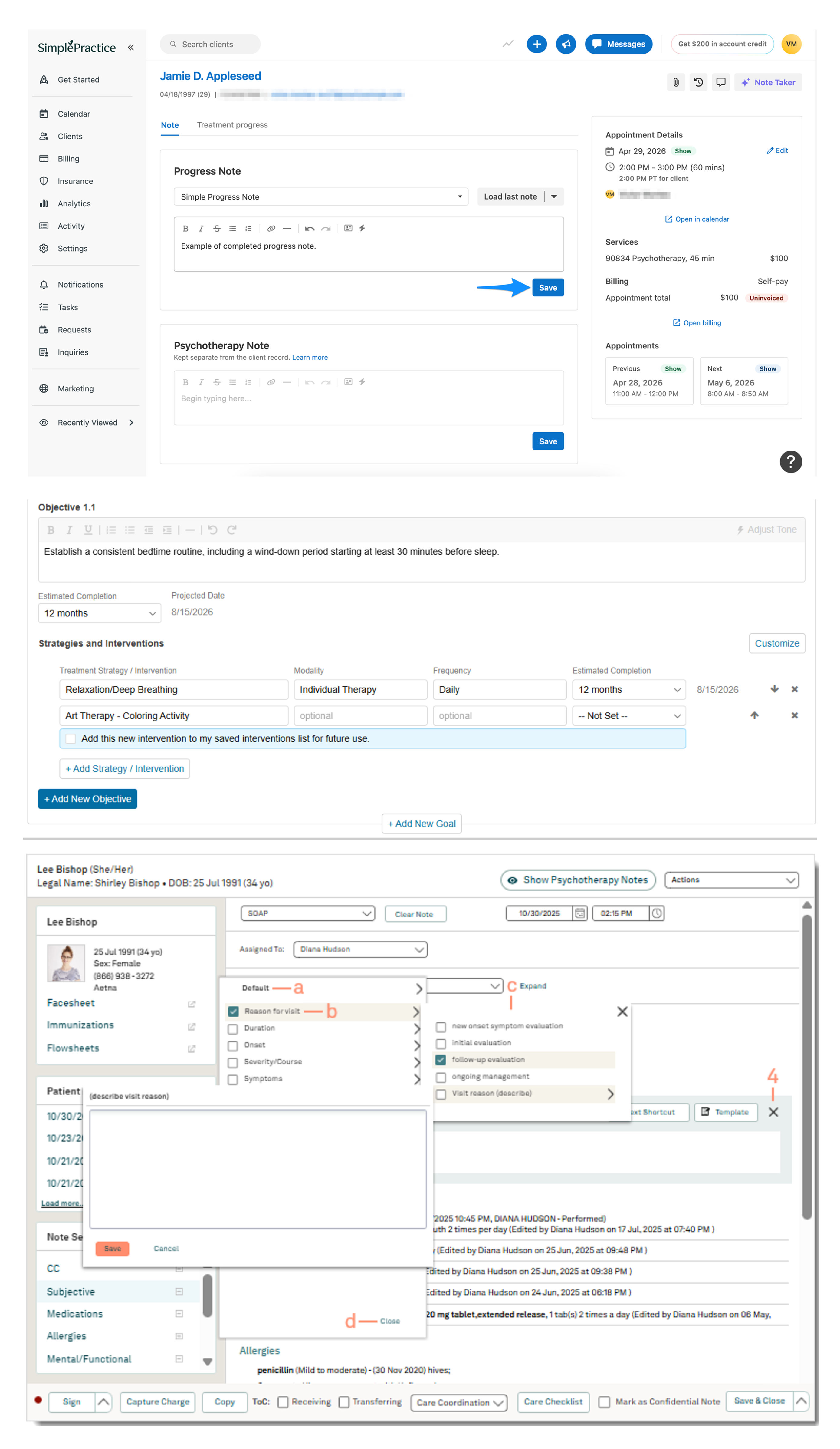
From competitor research, I had found forms were commonly displayed at paper width in similar software. Since we were expecting to onboard many Practices who were acustomed to the experiences on these platforms, there was an advantage to presenting a familiar pattern.
Arguements against changing to paper width
Change is scary
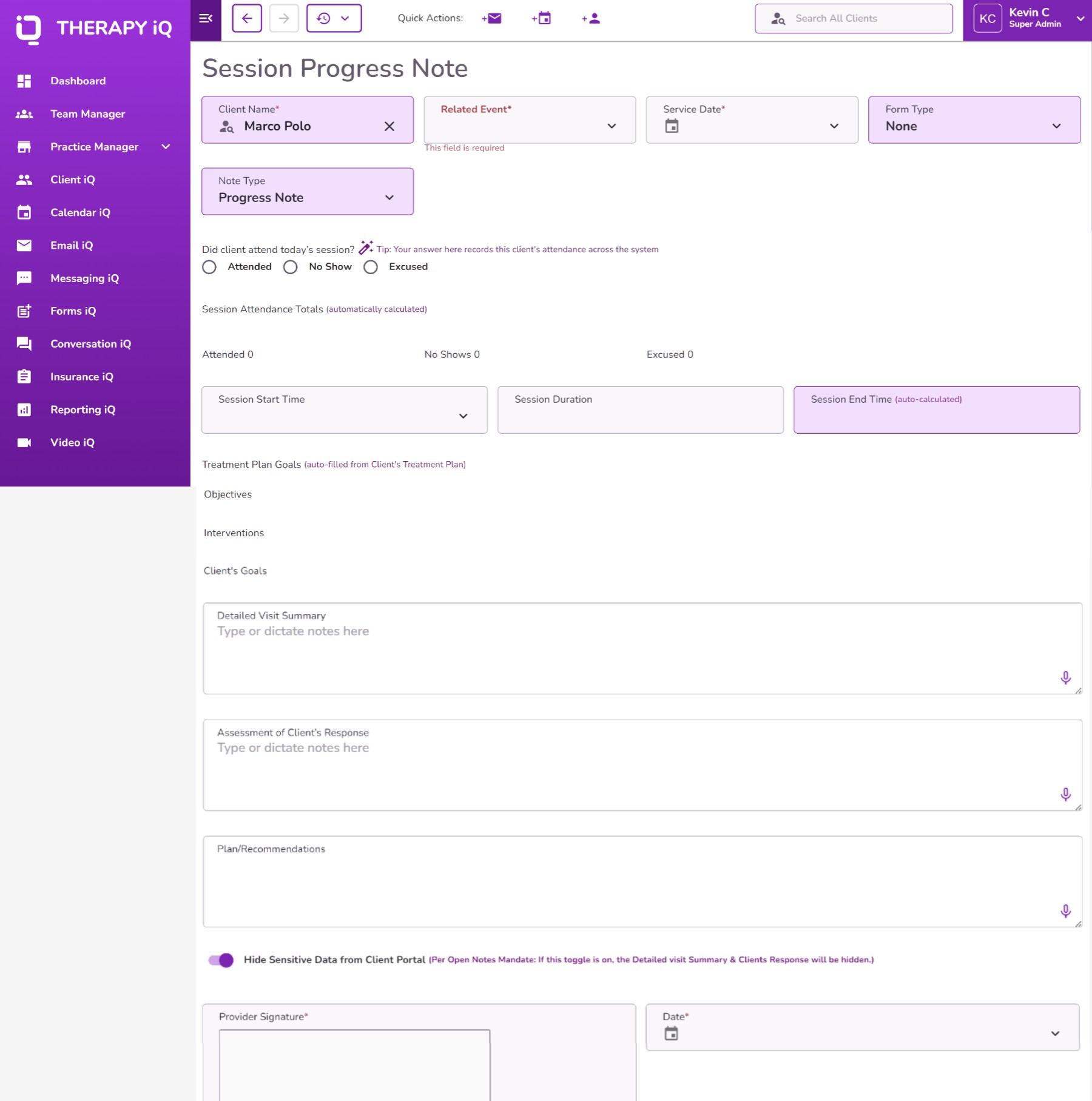
Existing users already have familiarity with the existing interface design. Changing where fields are located risked frustrating users. If we were going to make significant changes to how these forms were formatted, we wanted to limit the amount of changes we made to the organization of the fields.
Fit more content on screen
When content is allowed to fill all available space, more content can fit on screen simultaneously on larger displays.
Although this can have the positive impact of less scrolling needed, it also comes at the cost of user attention and comprehension.





.png)