Treatment Plan & Progress Note Forms

Clinical documentation for mental healthcare treatment planning and tracking

Fall 2022

Foundational work to overhaul the design of critical forms at the center of user workflows.


Project Details

Primary Tools

Figma
Figjam
Jira

Platform

Responsive Web App

The Brief

Create a flexible template for progress notes and treatment plans that met all clinical and insurance requirements for a wide variety of treatment cases.

This will serve as a template for all forms going forward.

Treatment Plan

The road map for most mental healthcare treatment is the Treatment Plan.

This is something the clinician will create around the beginning of treatment, and is sometimes worked on collaboratively with the patient.

Progress Notes

Every time the clinician sees their client they will need to create a Note for that visit. These act as benchmarks to record details of the visit and check patient progress with.

Discovery/Research

Research Process

Anytime I approach a new problem space or design for a new type of user, it is important to take a layered process to understand the industry, problem space, basic user needs and expectations before drilling down on more specific points through interviews with users.
Industry Research
Before speaking to our current users, it was important as part of this project that I understood the full context of how these documents are used in a mental health setting.
I used a combination of reputable industry organizations as well as guidaince from industry professionals.

Goals

  • Better familiarize myself with the day-to-day occupational duties of the clinicians who use TiQ.
  • Understand why different approaches to mental healthcare treatment are taken.
  • Learn the needs of different types of clinicians.

Takeaways

I familiarized myself with a number of standard templates like DAP, SOAP, BIRP and many more that are used depending on the preferences of the clinician or therapy modality. There can be further customization based on the needs of the Practice or clinicians.
‍
It is common to attach screening forms to progress notes, to evaluate the patient's current state specific issues like drug use/abuse, mood disorders and more. Some specialties require additional data points. A prescriber may need to enter a patient's physical vitals, or a drug addiction specialist may need to document instances of use.

I learned that treatment plans and progress notes can be requested by insurance to verify that the care they pay for is yielding results. Courts may also request these documents if the client is involved in a case where insight into their mental state is important. A Treatment Plan may also be worked on collaboratively with the patient.

After this I felt I knew what to look for as I put on my sleuthing cap and peaked over at how our competitors were handling these documents.
Competitor Product Research
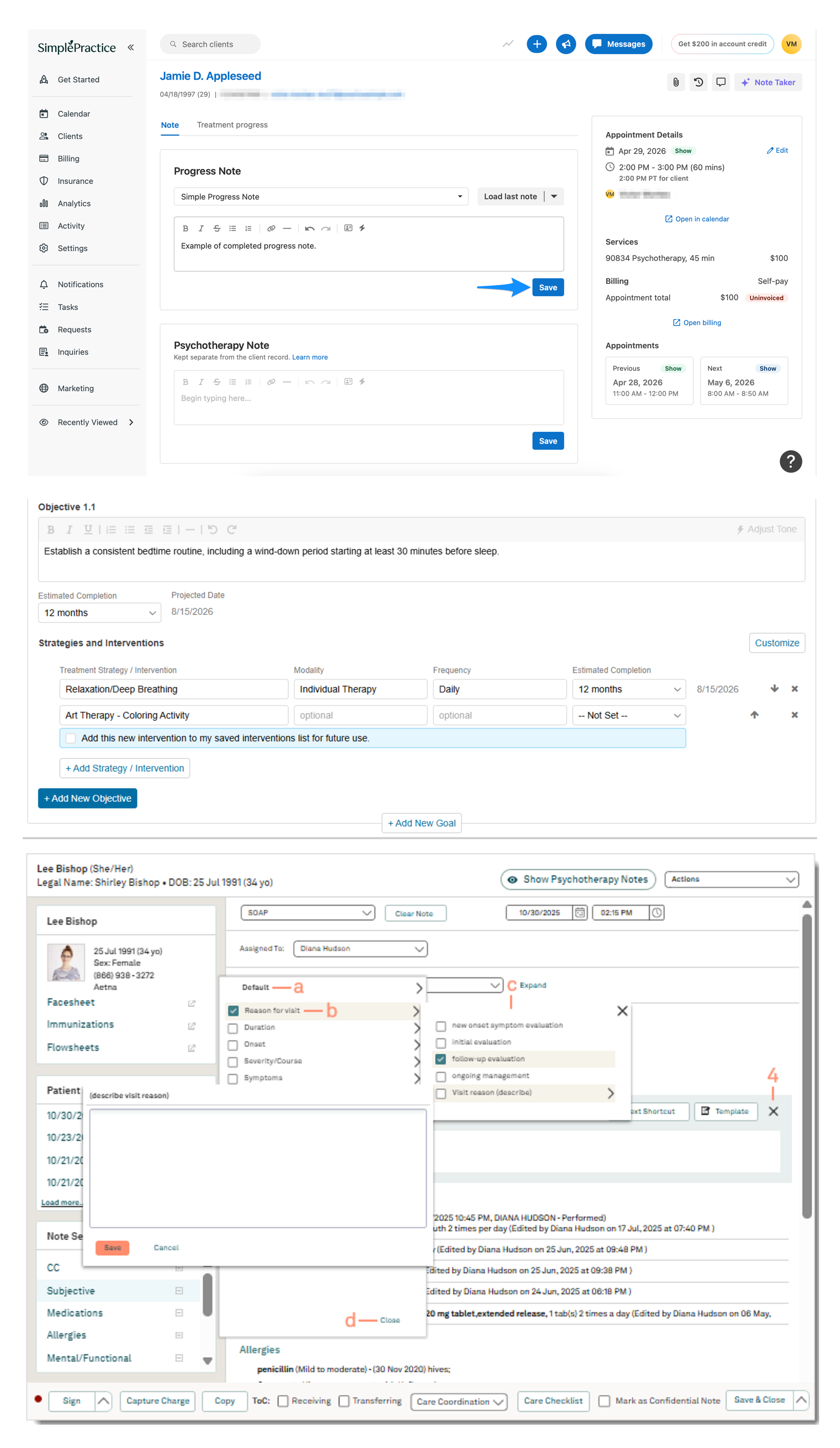
Screenshot of SimplePractice software interface displaying three sections: a client notes view with progress and psychotherapy notes and appointment details; an objective setup panel detailing a therapy goal with strategies and interventions and completion dates; and a detailed patient note interface showing legal and demographic info, SOAP note fields with dropdown menus, allergies, and other patient data entry controls.
SimplePractice, TherapyNotes and Tebra software
Compared progress note and treatment plan templates offered by top competitors TherapyNotes, SimplePractice, Tebra and more. Research was compiled in Google Sheets and Docs.

Goals

  • Learn the experience users switching to our platform are accustomed to.
  • Identify discrepencies between our forms and competitors, determine if any gaps need to be addressed.

Takeaways

SimplePractice as one might suspect provided a very minimal default template, allowing users to get as simple as a single text box field. Event information is sticky to the right side, and the rest of the note is divided into tabs, keeping the information on screen at once to a minimum.
‍
TherapyNotes had more granular controls than SimplePractice, allowing target dates and frequency to be included alongside objectives and interventions.

Tebra's configurations took it another step further, with options for a range of niche clinical scenarios. However, increased functionality came at a cost of usability, as forum posts from users revealed.

With a clear understanding of how other platforms have chosen to format these documents and the decisions they made, I was ready to start speaking with users who had recently transitioned from using these platforms.
User Research
I conducted half hour interviews with clinicians from 3 Practices of varying size, prescribers and therapists.

Goals

  • Learn how progress notes and treatment planning integrated into real world workflows.
  • Learn how clinicians were using notes and treatment plans within the context of the EHR and discover limitations they are facing.
  • Learn how we can speed up the documentation process.

Takeaways

All clinicians agreed that progress notes were an essential part of tracking a client's treatment progress and also a mandatory step in all of their workflows.

The number of notes completed per day varied by the discipline, with clinicians having to complete anywhere from 3-12 notes a day. On the high end was a therapist who specialized in family therapy and as such needed to complete a note for each family member present. Notes could be created in 5 minutes or can take as long as 30 minutes for an eventful session

There was a wide range of data points each Practice wanted to include from a clinical perspective that varied by the type of treatment being offered, preferences of the clinician or Practice and whether insurance was accepted.
Some just didn't find certain fields necessary in their work, but others were happy with the fields included in the default template.

While the narrative sections took up the majority of the time to complete a note, the repitition of having to enter time and event info in each note drew more ire from interview participants. Anything that can speed up this process for them is helpful.
Family Therapy Journey Mapping

Utilizing a Persona of a family therapist, we were able to pressure test our documentation workflow with a complex scenario like Family Therapy.
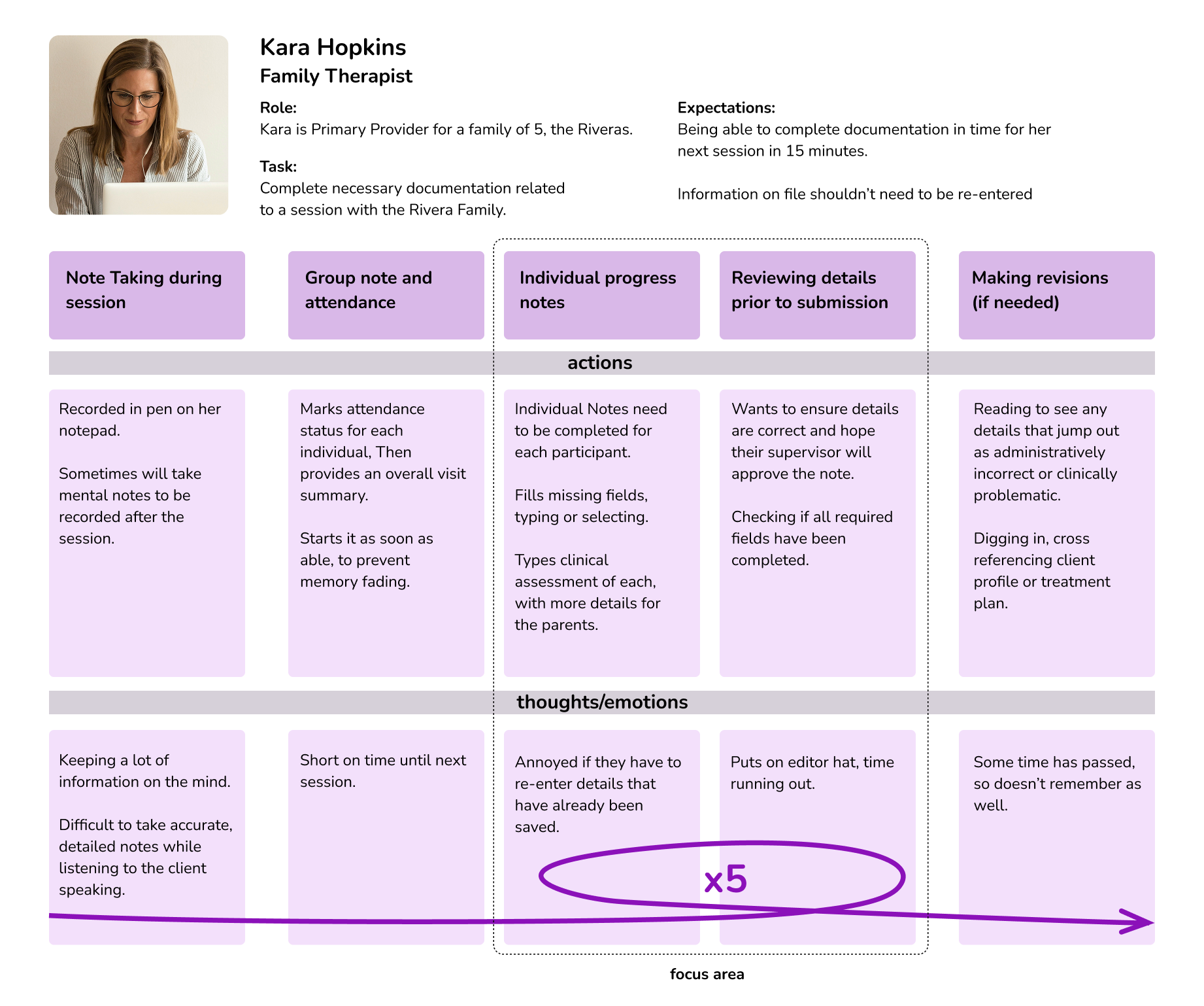
User journey map for Kara Hopkins, a family therapist, detailing her role as primary provider for a family of five and task to complete documentation for Rivera Family sessions. Expectations include completing documentation within 15 minutes and avoiding re-entry of saved information. The map outlines actions and thoughts during steps: note taking during session, group note and attendance, individual progress notes, reviewing details before submission, and making revisions if needed. Includes notes on challenges like taking accurate notes, marking attendance, completing individual notes, verifying details, and concerns about administrative errors and memory lapses. A purple arrow highlights repeated frustration in the individual progress notes step.
property of Therapy iQ

Product Requirements

Constraints

This project represented one of the most central parts of mental healthcare treatment, so the needs of therapists and treatment teams guided development requirements and constraints.
‍
There were very few business and technical constraints for this project.
‍
System Logic Requirements
Must retain existing field logic connections to upstream and downstream workflows.
Accessibility Requirements
Must comply with ADA guidelines for digital accessibility.
Insurance Requirements
Certain fields must be included for insurance and auditing purposes.
Customization Requirments
Must be customizable within our form builder, including custom forms that had already been created by users.

Considerations

Printing, PDF conversion
Many forms need to be sent as a PDF or printed.
Mobile, responsive behavior
While it is less common for clinicians to access on a mobile device, it must still be supported.
Multi-tasking
Progress Notes may sometimes be completed alongside a telehealth session window, a previous note or treatment plan.
Supervisor Review
For many Practices, notes from interns and junior therapists must be reviewed and approved by a supervisor.
Repetition
When completing progress notes for each client who attended a group or family session, this process can become repetitive.
System Connections
Data entered in these documents may get referenced for downstream forms and reports.
Future Access
Documents may be accessed, referenced or audited at a later date.

Architecture

This project represented one of the most central parts of mental healthcare treatment, so the needs of therapists and treatment teams guided development requirements and constraints.
‍
There were very few business and technical constraints for this project.
‍
Form Responsiveness

Limiting width to match paper

The decision was made that for the following reasons, formatting for forms in Therapy iQ would no longer expand horizontally infinitely. They would be limited similar to a piece of paper.

PDF-ability

Every form we built required a PDF companion. If we continued to use forms that take the full width of the display, we would need to create custom pdfs that reduced the amount of information stored horizontally.

Print-ability

Athough the world has rapidly moved online, healthcare has been slower to adapt and it is still necessary for many Practices to have print versions of many of their forms.

Splitscreen-ability

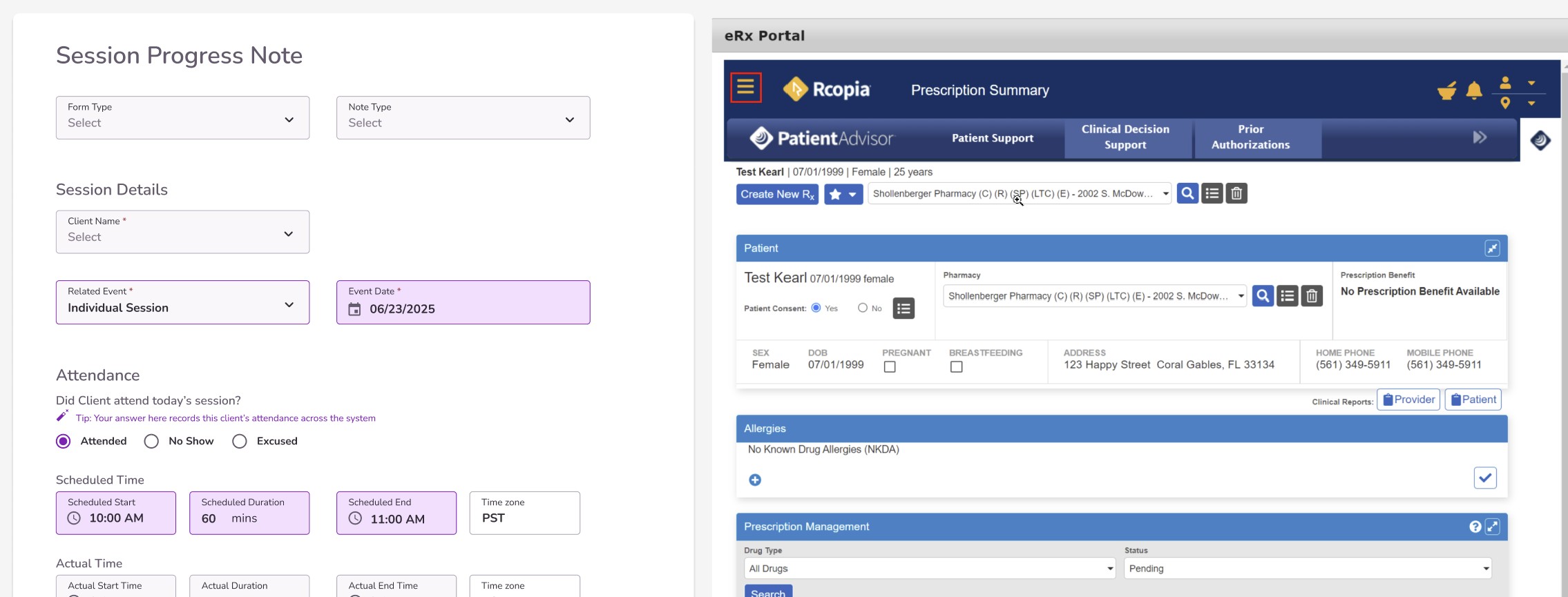
Another advantage is that it allows split screen capabilities that can be very useful in the context of a therapy session, if for instance a progress note could be open alongside an e-prescribe or even a telehealth session.

Familiarity

From competitor research, I had found forms were commonly displayed at paper width in similar software. Since we were expecting to onboard many Practices who were acustomed to the experiences on these platforms, there was an advantage to presenting a familiar pattern.

Arguements against changing to paper width

Change is scary

Existing users already have familiarity with the existing interface design. Changing where fields are located risked frustrating users. If we were going to make significant changes to how these forms were formatted, we wanted to limit the amount of changes we made to the organization of the fields.

Fit more content on screen

When content is allowed to fill all available space, more content can fit on screen simultaneously on larger displays.
Although this can have the positive impact of less scrolling needed, it also comes at the cost of user attention and comprehension.
Form Structure
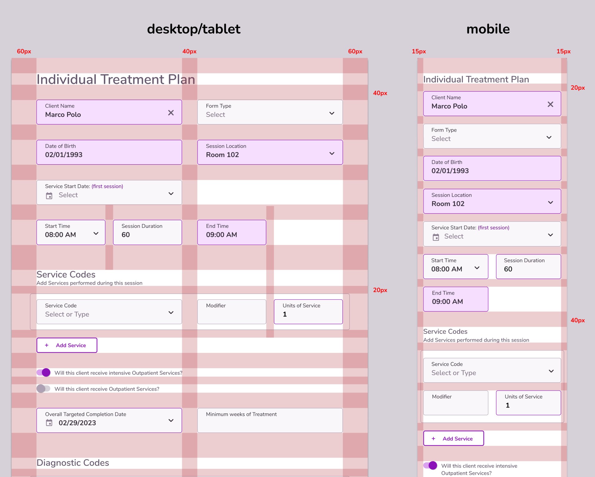
Comparison of an Individual Treatment Plan form layout for desktop/tablet and mobile, showing input fields for client name Marco Polo, date of birth, form type, session location, service start date, start time, session duration, end time, service codes with service code, modifier, units of service, and options for outpatient services, with pixel spacing guides for margins and padding.
property of Therapy iQ

Form Structure

The form would be built around 2 primary columns, that would respond to the device width only to a certain point.
Some fields had short enough content that they could even be half size.

Spacing

20px vertical spacing was used for related items, with 40px between unrelated items and 60px to delineate the end of a section.

Mobile

On mobile, the form responds by displaying content in a single column in order to be easy to read and interact with.
Spacing guidelines were reduced on mobile to allow more content to fit on screen.
Content Structure
Comparison chart showing simple document breakdown for Treatment Plan and Progress Notes, each divided into event info, clinical info, and signatures. Event info for Treatment Plan includes form type, client name, date of birth, session location, date, time, services provided. Progress Notes event info adds note type, related event, attendance, and attendance record. Clinical info for Treatment Plan covers outpatient services, treatment schedule, diagnostic codes, clinical assessment, service schedule, discharge criteria. Progress Notes clinical info lists diagnostic codes, treatment plan goals, and clinical notes based on note type. Signatures for Treatment Plan include provider, supervisor, client, parent; Progress Notes has provider and supervisor only.
Changes to the structure of content were minimized in this phase in order for users to adapt to the other layout and interface changes. Content was organized around these 3 broad sections.

Time & Event Info

This information was easy to automate because most of it was being dictated by the event. This also meant it was important that users always had an event connected to their note. Clinical timelines were separated from session time information.

Clinical

This section is where the clinician will include identified problems and define goals for treatment. They can can get very long and detailed. Many insights were gained about opportunities to improve this section, but changes were limited upon initial release to not overwhelm users and allow the team to evaluate changes separately.

Signatures

This section's layout remained mostly unchanged during this phase, though insights from interviews informed future changes.

UI Design

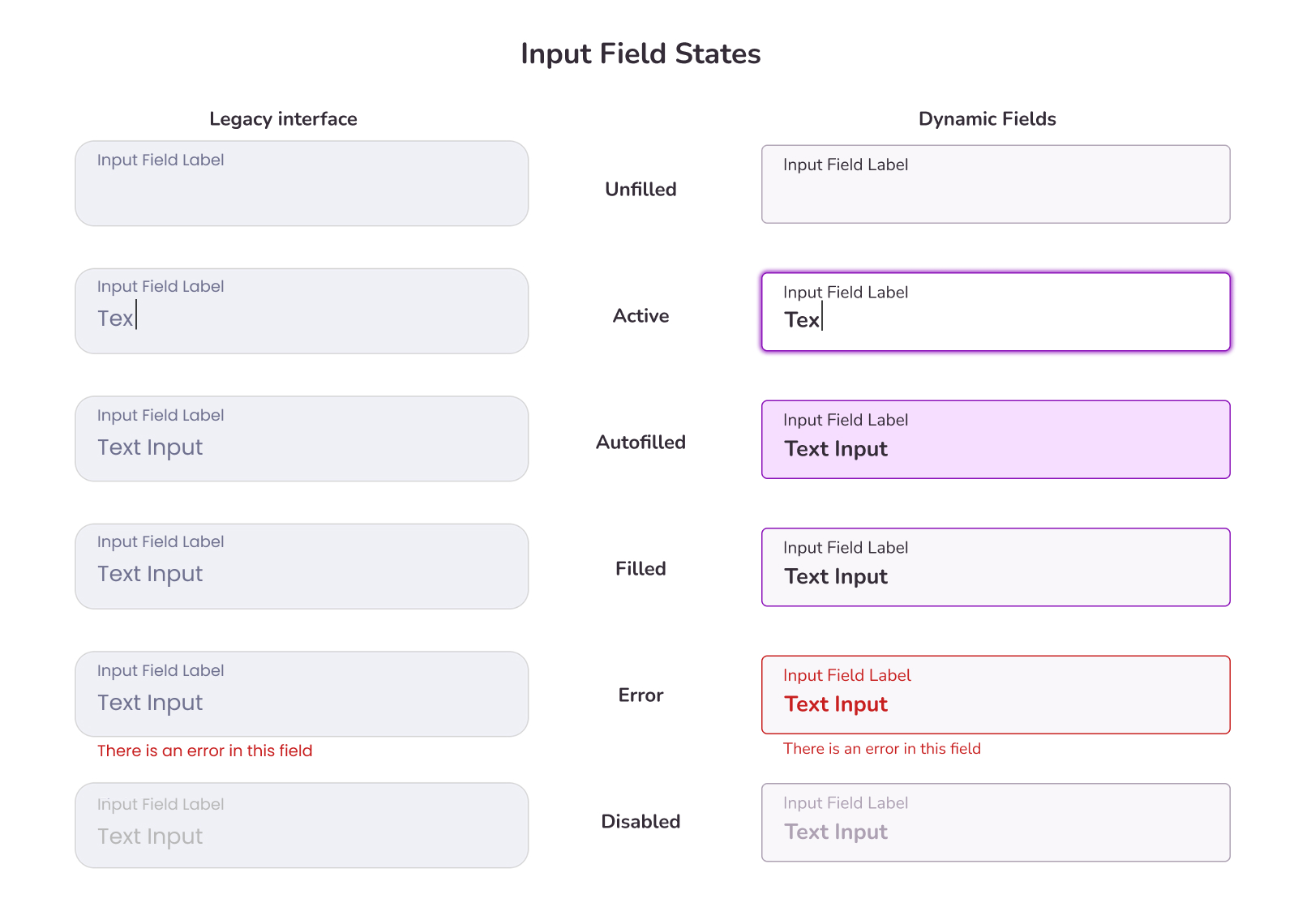
Establishing distinct field states

The original field design did not visually differentiate the status of the field. We wanted fields to be able to communicate their status to users in a simple way. The new dynamic field states allow users to quickly identify where they are working, and what is still missing input. Efforts were also made to increase the contrast and prominence of the text in these fields.
Comparison of input field states between legacy interface and dynamic fields. States shown from top to bottom: Unfilled, Active with cursor in text area, Autofilled with bold text, Filled with standard text, Error with red border and error message, Disabled with faded text. Legacy input fields have a uniform gray background and border. Dynamic fields use purple borders for active, autofilled, and filled states with a light purple background for autofilled. Error state uses red text and border. Disabled state appears faded and grayed out.
property of Therapy iQ

Highlighting automations

One of the best parts about the Therapy iQ system was all the upstream automations that would allow data to populate the form. Some users expressed confusion about how certain data made its way into the form, so we wanted to highlight instances when that information was auto-filling. The solution was adding a purple fill to input fields that were filled by automations. This also doubled as a marketing tool, as sales could show off to new leads how much of the data in our forms can autopopulate.
Desktop Interface

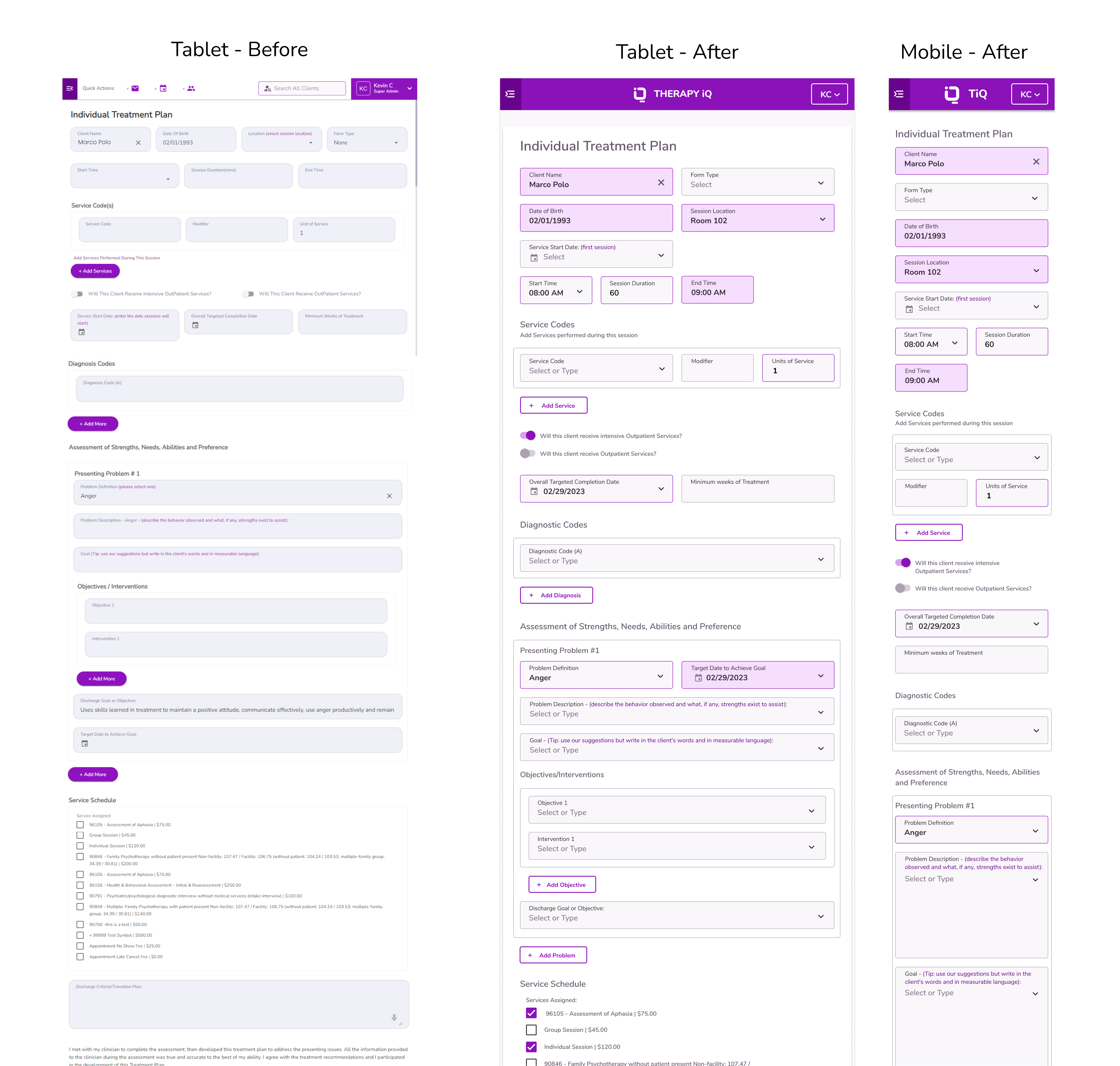
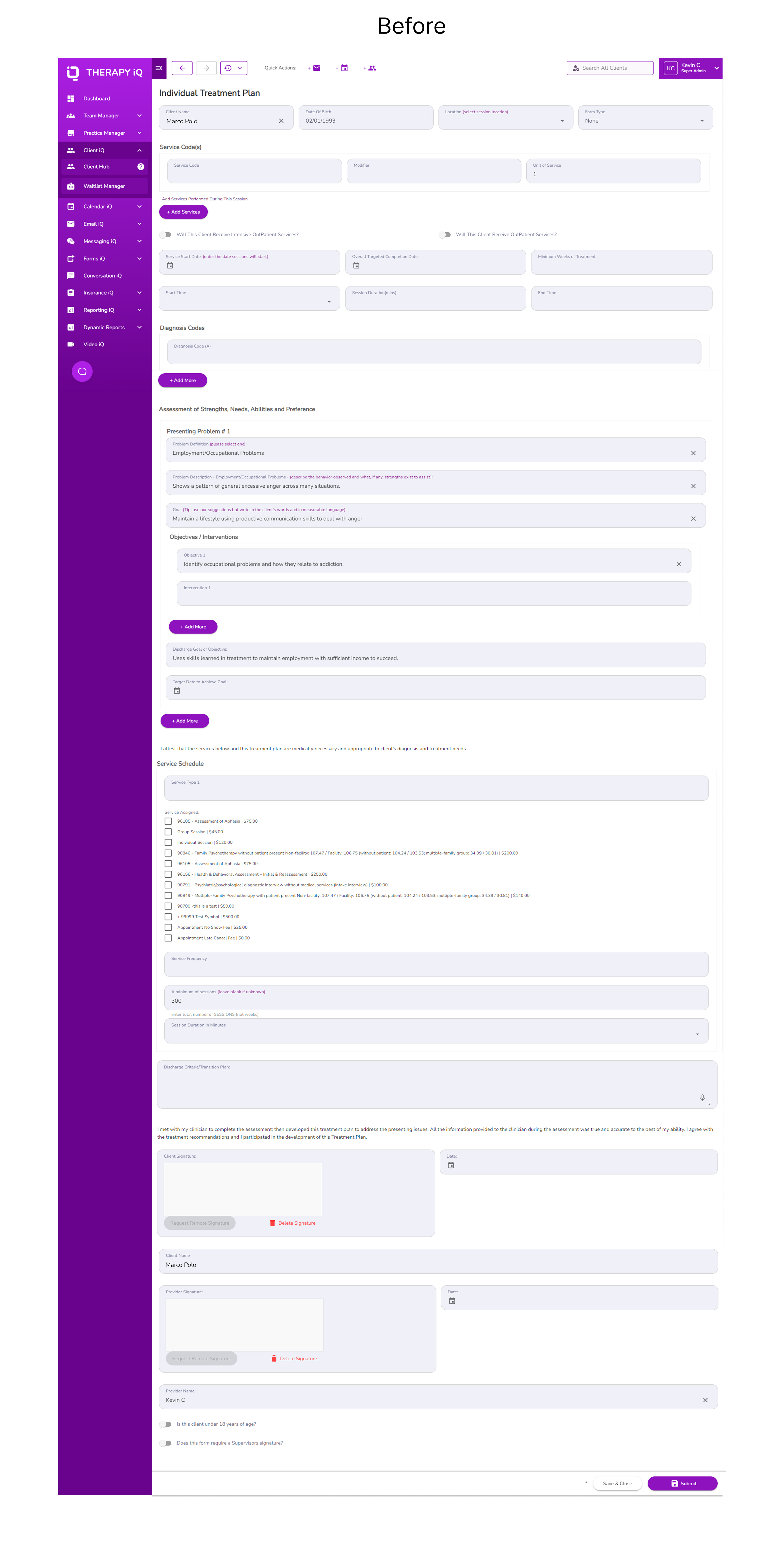
Old Design

The old interface, with fields stretching to extremes, difficult to read fields, and emphasis on optional elements.
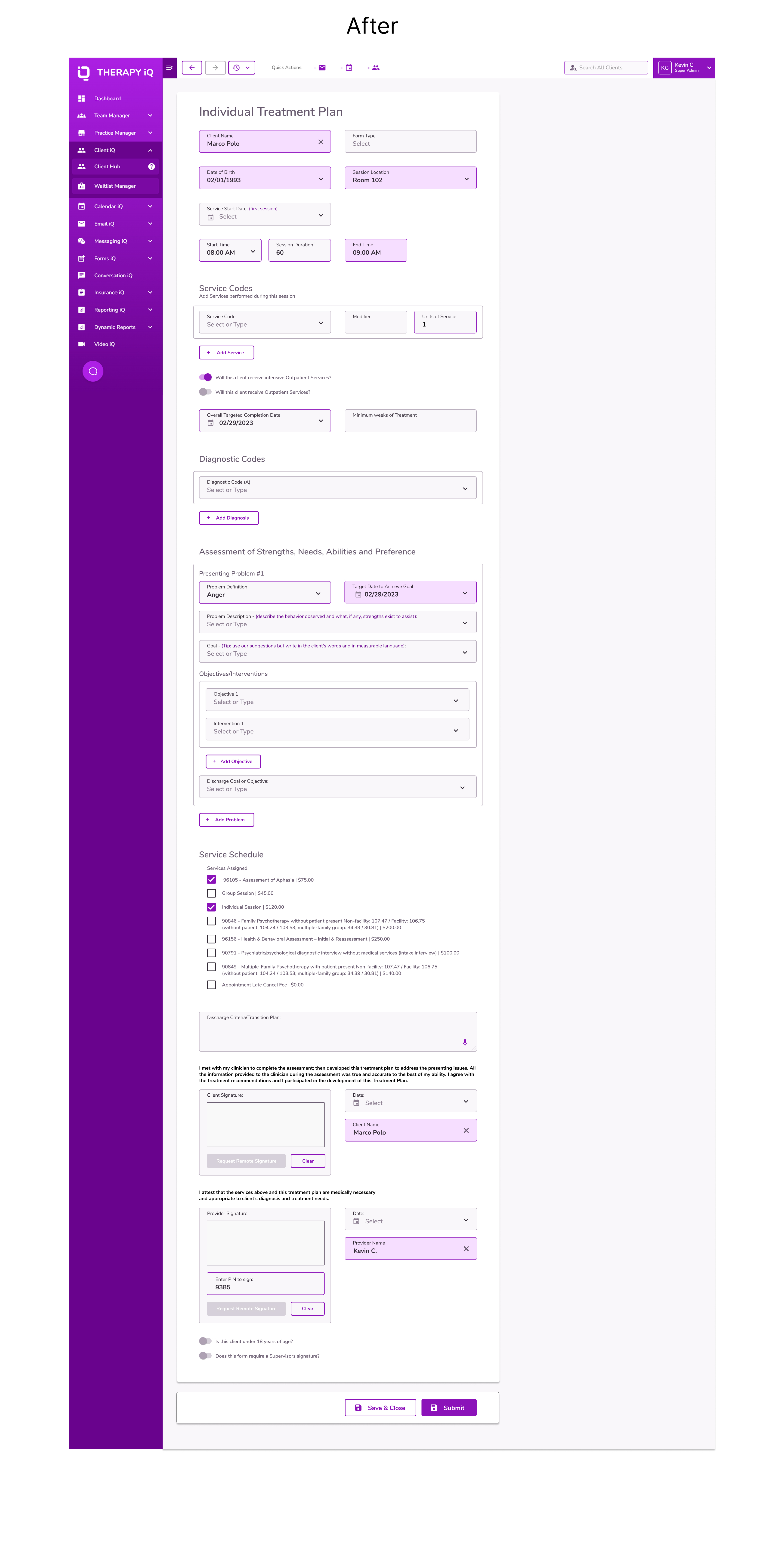
New Design

  • Fields populated via automations are highlighted prominently, demonstrating the power of the software and allowing users to understand how fields were populated.
  • 2 column grid acts as the foundation of the form design, with short content fields acting as half-size elements.
  • Sections are more clearly deliniated, and legibility is improved throughout.
  • Experience is standardized accross all but the smallest device widths.
property of Therapy iQ
Mobile Interface
For touch input devices like smartphones and tablets, the new interface affords easy interaction with large touch targets and layouts that respond better to smaller screen widths.
Comparison of an Individual Treatment Plan interface before and after redesign on tablet and mobile. The 'Before' tablet view is cluttered with numerous fields and checkboxes like client name Marco Polo, date of birth, service codes, diagnosis codes, and treatment objectives. The 'After' tablet view is cleaner and more structured with highlighted fields for key data like client name, date of birth, session location, start time, and a more organized layout for service codes, diagnostic codes, objectives, and discharge goals. The mobile 'After' view shows a compact, vertical layout with the same key fields as the tablet version for easy use on smaller screens.
property of Therapy iQ

User Feedback

Release

Internal testing was conducted prior to releases. I worked with technical team members to ensure the interface changes were implemented to UI specifications. An overhaul to our UI kit informed by the research conducted was released first.
Form refactoring followed soon after. Treatment Plan was released first, followed about a month later with the new layout for progress notes.
User Feedback

Positive

New users and prospective customers were really happy with the new form design. This helped our sales team close deals with Practices that were thinking about switching.
Many existing users also were excited about the new design, attesting to better legibility and content organization.

Negative

As expected, there was opposition from some users to this release. We collect feedback via an feedback forum we call the Idea Board, and one post wanting the fields to stretch accross the whole screen garnered few dozen votes.
This was a fairly significant number, however one key piece of context, was this was received before features that took advantage of this space, like an eprescribe panel or Practice Intelligence AI assistant were rolled out.
Future Enhancements
This was only the first step in a series of enhancements to the Note taking and Treatment Planning, and many more phases of enhancements followed in the months and years that followed. Each building on the foundation established here.
Screenshot showing two side-by-side software interfaces: on the left, a session progress note form with fields for form type, note type, client name, related event set as Individual Session, event date set to 06/23/2025, attendance options with 'Attended' selected, scheduled time from 10:00 AM to 11:00 AM PST; on the right, an eRx Portal with a prescription summary for patient Test Kearl, female born 07/01/1999, including pharmacy selection, patient consent options, address, phone numbers, allergy information with No Known Drug Allergies, and prescription management with drug type set to All Drugs and status Pending.
Progress note with prescription management panel splitscreened.
Property of Therapy iQ

Project Takeaways

Planning and preparation

Being methodical in my approach to research allowed me to start broad and go deeper at each step in the process, which helped inform the goals and objectives of each next step.

Allowing customization

Anytime you can offer users customization without creating unnecessary tech complexity, is a win for users, and allows the business to appeal to more customers.

Room to Grow and Evolve

It was important to consider the longevity of these changes. This was to be the first phases of note and treatment planning template improvements as we increased the level of sophistication of the forms and supported treatment processes. It was only possible to build and evolve from a strong, flexible foundation.

Check out some of my other projects: